The Design Talk I chose to listen to was with Dave Eggers, an author who writes about art and music for magazines, though his design work has been featured in periodicals including Print and Eye, and in 2003, his design work forMcSweeney's was featured in the National Design Triennial at the Cooper-Hewitt National Design Museum in New York, and in the California Design Biennial.
Debbie Millman is an extremely important and admirable figure in the design world. She is President of the design division at Sterling Brands, one of the leading branding firms in the country. In addition, Millman is President of AIGA, while also maintaining chair of the School of Visual Arts' master's program in Branding. She is a well-known author, an editor for Print magazine, and finally, hosts the podcast "Design Matters".
According to the Sterling Brands website, "Design Matters" is a design podcast hosted by Debbie Millman that is host to a stimulating point of view on graphic design, branding, and cultural anthropology. Millman and her guests explore challenging and compelling topics found within today's design world.
What I found most interesting about her interview with Dave Eggers was that he constantly felt like his work had fallen short and rarely liked anything he ever did. Considering what an amazingly talented person he is, I found this to be pretty fascinating. Though I hardly compare to his talent, I do find myself disliking a lot of what I create, as well. Regardless of how he feels about his work, Eggers still claims he has a strong sense of what is good and what is bad, also interesting.
4.27.2011
4.25.2011
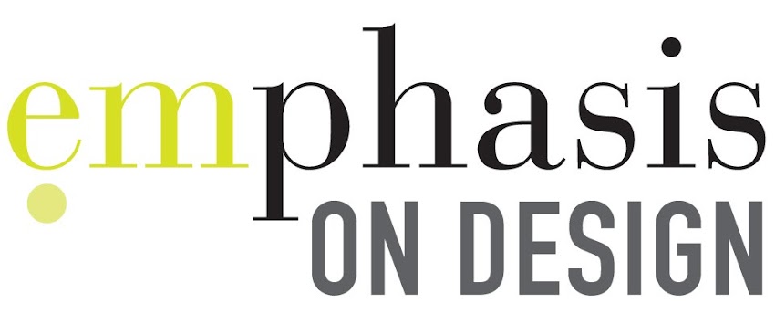
Final Typography Workbook
This is a digital mockup of my final typography workbook entitled, "EMPHASIS: A Look at Typography". For this project, we used the information from a number of sources to create a workbook that was well-designed, informative, and easy to follow that outlined basic typography guidelines. This book will be a big help throughout the rest of my graphic design career, and I can tell I will be using it a lot already.
I'm still awaiting the hard copy of my book from the printing company, but will upload photos onto my behance when it arrives! Don't be shy! If you like what you see, "appreciate" my work on behance. If you would like to download my workbook as a PDF for your own use, you may do so here.
Open publication - Free publishing
I'm still awaiting the hard copy of my book from the printing company, but will upload photos onto my behance when it arrives! Don't be shy! If you like what you see, "appreciate" my work on behance. If you would like to download my workbook as a PDF for your own use, you may do so here.
4.21.2011
Become Somebody Else Bookcovers
I love these book covers by Love Agency for Mint Vinetu Bookstore. So clever, so smart, and so awesome. Definitely distinguishes these from ordinary book covers.

4.19.2011
typography journal 10
I love the Good website. As a whole, I think the website is well-designed, clear, and interesting. I also like the way that the viewer and their moue can interact with the website. One of my favorite sections is the infographics section. The information is very clear, but displayed in an interesting way. The way typography and graphics work together is really exquisite, and inspiring.
In terms of the videos, I think that there is a nice combination of factual information, humor, and interesting concepts. The pacing varies depending on the information needing to be conveyed and the purpose of the video as well as the overall tone. The majority of the videos have a clean style with a few graphics that help out the information and to create interest to keep the viewer involved. The transitions are interesting, as some text is rotated or enlarged to move off of the screen, while others somehow morphs into the next set of type or the next image. Overall, I think most of the videos are successful, the most interesting being those that covey factual information in an interesting way.
In terms of the videos, I think that there is a nice combination of factual information, humor, and interesting concepts. The pacing varies depending on the information needing to be conveyed and the purpose of the video as well as the overall tone. The majority of the videos have a clean style with a few graphics that help out the information and to create interest to keep the viewer involved. The transitions are interesting, as some text is rotated or enlarged to move off of the screen, while others somehow morphs into the next set of type or the next image. Overall, I think most of the videos are successful, the most interesting being those that covey factual information in an interesting way.
4.18.2011
in-class blog: print vs. screen
I think audience experience varies greatly from print to motion work. When working in print, I think the audience controls the pacing more, due to how quickly they read and how much information is on the page. I also think that the viewer won't necessarily have as strong an emotional reaction as they may if sound were included. In terms of motion, I think the designer controls the pacing, because the viewer only sees what's on screen. A lot of times, I think the effects used on the type in motion can also help to better convey the meaning of the words. In motion you can also add sound effects or music to help convey a message, which you can't do when working in print.
typography journal 09
After watching the SVA video lectures by Jakob Trollback, I picked up a few important pointers:
The first being what I thought was most important, you should never design to decorate or design just to design, but rather say something with your work. Design for a reason.
I also found it interesting that he suggested to look for inspiration outside of design books, because they won't help you. To an extent, I agree with his statement, plus I think it prevents you from looking too similar to another designer.
Trollback also says that participation is the best way to get someone to do something, which I thought was both true and interesting considering his other views on interactive design.
Finally, I thought his views on interactive design were quite interesting. He doesn't prefer it, as it gives the viewer freedom to disengage at their discretion, stopping potentially before the message he wishes to convey is completed. I had never thought about interactive design in this way, only in that the viewer is able to engage with the material however they wish and in their own unique way.
4.12.2011
kinetic typography on youtube
After watching the examples of kinetic typography on youtube, I noticed that most of the videos used the same effects: zoom in, zoom out, and rotation. Though these effects work, when they are used repetitively it causes the words to all have the same amount of emphasis and relies on pacing to show importance rather than using pacing and effects to create a hierarchy. I also experimented with watching the video on mute and watching the video with sound. When watching with sound, the result is much more powerful because a lot of times, the text relies on sound cues for pacing and emphasis. If the video incorporated music, it also set the tone for the video. The following are a couple of examples of successful typography in motion.
Though this song was god awful, I stuck through it because I liked the visuals in the video and how typography interacted and emphasized the song lyrics. They also used symbols that everyone would recognize to emphasize certain song lyrics.
Though this example doesn't have as many visual elements and is also simple in its color palette, I think it is still successful in the way that type moves and enters and exits the screen. Everything flows together well and the pacing really accentuates the attitude of the character.
kinetic typography
The speech I chose is a spoken word poem entitled, "Totally Like Whatever, You Know?" by Taylor Mali. I chose to do a spoken word poem over the previous speech i had, Robert F. Kennedy's Presidential Campaign
_ Who is speaking?
Taylor Mali
_ Why was/is the speech important to society?
Mali discusses the way in which Americans today interact and speak. He claims that there is no longer any conviction in the way people speak, rather apathy and a general sense of underwhelming.
_ Why do you feel it is important or interesting?
I think this speech is interesting because it is a funny approach to considering an issue that really is prevalent in American culture. It is also interesting because I think it's something that people don't consider, but are faced with daily.
_ What is the emotion, mood, tone, personality, feeling of the speech?
The overall mood of the speech is light hearted, funny, and sarcastic.
_ What is intonation, emphasis, what is loud, stressed, or soft. Where are there pauses...
The overall speech is very varied in regards to emphasis, as that is a large part of spoken word. He used pauses to accentuate certain things and to create humor.
_ What do you FEEL should be loud or soft, long pause or rushed?
I feel as though there could be more more pausing in the latter part of the speech because it feels a bit crammed.
_ Is there a call to action? When listening to it what are key/emphasized words?
The call to action is to be more assertive, to openly say what you feel. The emphasized words are "like" and "you know", the things that make speech casual and passive.
_ How does it make you feel?
The speech makes me laugh and feel a little silly as I use the word "like" quite often..
_ How do imagine that the audience felt?
I think the audience felt similarly, as the purpose of the speech is to be humorous and thought provoking.
_ Could there be another interpretation of the speech?
I don't think so, maybe condescending?
_ Write/find a short bio, of the person giving the speech.
As a slam poetry performer, Taylor Mali has been on seven National Poetry Slam teams; six appeared on the finals stage and four won the competition (1996 with Team Providence; 1997, 2000 and 2002 with Team NYC-Urbana). Mali is the author of What Learning Leaves and the Last Time as We Are (Write Bloody Publishing), has recorded four CDs, and is included in various anthologies. Poets who have influenced him include Billy Collins, Saul Williams, Walt Whitman, Rives, Mary Oliver, and Naomi Shihab Nye. He is perhaps best known for the poem "What Teachers Make."
He appeared in Taylor Mali & Friends Live at the Bowery Poetry Club and the documentaries "SlamNation" (1997) and "Slam Planet" (2006). He was also in the HBO production, "Russell Simmons Presents Def Poetry," which won a Peabody Award in 2003. Taylor Mali is the former president of Poetry Slam Incorporated, and he has performed with such renowned poets as Billy Collins and Allen Ginsberg. Although he retired from the National Poetry Slam competition in 2005,[6] he still helps curate NYC-Urbana Poetry Series, held weekly at the Bowery Poetry Club.
4.01.2011
typography journal 08
Exploring the Design Observer website, I read two articles. Here are some thoughts.
"Type Means Never Having to Say You're Sorry"
"Type Means Never Having to Say You're Sorry"
I think some similar, yet better alternatives to Futura are News Gothic (less pointy, and a little less aggressive, though similar x-heights), Avenir (geometric and same width, but switches the single-story "a" to a two-story), and Neutraface (just as quirky as Futura, pointy capital "A" with a low crossbar).
"Ten Graphic Design Paradoxes"
This article by Adrian Shaughnessy explores ten paradoxes that can be found in graphic design. Some discuss weird ways that you could learn to be a better designer, and others break down the ego that every designer has at one point or another. My favorite paradox is "Ideas usually fail not because they're bad ideas, but because they're badly presented". As a student, I feel as though I can particularly relate to this one, as many of the others speak to a more professional level. I often feel discouraged when working on a project and the amazing design thoughts that are in my head do not translate to the paper well-enough to convince my professors that they are good ideas. I usually end up tossing out these ideas with the belief that they are impossible to convey, or just bad ideas. This article helped me to realize that in fact, I need to just stick with the idea, and show to the best of my ability at that time what the idea could develop into, rather than rely on verbal description, or imagination.
I also found another paradox to be quite revealing of the world I will soon be a part of upon finishing school: "When a client says the words – "You have complete creative freedom," they never mean complete creative freedom". Schughnessy says it how it is, "Whatever you show them, they will have a problem with. Happens every time."
APRIL FOOL'S
For April Fool's Day, Google has pulled several tricks, but this one so far has been my favorite.

Searching 'Helvetica' on Google changes the font on the search page to everyone's favorite font: Comic Sans.
NOT OKAY, GOOGLE.
Subscribe to:
Posts (Atom)