these band posters are by kevin tong, and are beyond stunning.
they are all hand-drawn before being scanned in for some editing work.
some great inspiration, as everything is working, from the colors to the textures, to the composition.
enjoy some more HERE.
11.29.2010
fancy artists and their colors.
banksy
- Stenciled, charged, street, grungy, haphazard, layered, playful, political, social, site-specific, witty, high-contrast
- Poppy, quirky, bright, colorful, linear, illustrative, childish, sophisticated, detailed, interesting, cartoony, patterned
11.21.2010
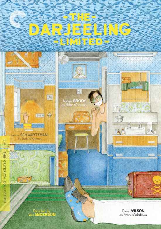
dvd packaging inspiration
final 3 designers/artists
1. cedric rivrain
I chose Cedric Rivrain because I love how he seamlessly transitions from line and contour drawings to fleshier illustrations, all within the same work. In addition, I think his work is extremely delicate and elegant. Rivrain is a French artist whose portfolio includes fashion design and traditional art, though he is best known for his exquisite fashion illustrations of runway models. Rivrain has also worked with many major fashion houses designing look books for them, and has collaborated with a few designers, creating ready-to-wear pieces.
2. wes anderson
I chose Wes Anderson because of his quirky sense of humor, and intent attention to detail that makes his films and illustrations so intriguing. Anderson is a film director, best known for his Academy Award nominated film, The Royal Tenenbaums. His films are specific in terms of color use, theme, cinematography, soundtrack, and use of dry humor. He is also considered an auteur, as he is involved in almost every aspect of his films' production. One little known fact about Anderson is that he is also a talented illustrator. The packaging and/or booklet for Anderson's films often feature his illustrations and illustrated storyboards for the film.
3. banksy
I chose Banksy because of his art's confrontation with social issues, and the level of difficulty and planning associated with his large-scale graffiti works. Banksy is an anonymous graffiti artist, located in the UK, though his works have been seen all over the world. Banksy uses stencils and often uses his work to call attention to greater social issues within communities and the world. Banksey is also known to play on the perspective and edges of the item on which he is stenciling. Examples of this include trapdoors and shadowing of figures so they appear three-dimensional.
11.20.2010
type/image based music video
i love this typograhy-based video for cee lo's new song.
the transitions are nice, and though there aren't any special effects, i think the simplicity of the text appearing with the words and the emphasis on other words creates a clean and interesting video.
enjoy, and prepare to have this stuck in your head for weeks.
the transitions are nice, and though there aren't any special effects, i think the simplicity of the text appearing with the words and the emphasis on other words creates a clean and interesting video.
enjoy, and prepare to have this stuck in your head for weeks.
11.17.2010
the illuminated letter
An illumination is an embellishment or additional decoration that enhances and draws attention to information on a page. Originally, illuminations were ordered by Kings and religious leaders to add interest and importance to manuscripts, religious texts, and important documents. In the Middle Ages, monks were the only people that created these illuminations, so illuminated texts were rare and expensive. Owning an illuminated text represented wealth and power as well as importance. As the middle class grew wealthier, scribes were added to the exclusive group that were allowed to create illuminated letters. The illuminated letter has undergone transformations throughout the ages, and is still used today in publications, representing both modern styles and styles that look back to those of the Middle Ages. Below are the various styles and characteristics of illuminated letters.
Celtic: From the early Middle Ages; features bright colors, birds and animals, rubrication (a shadow effect), and oftentimes, red dots surrounding the illuminated letter.
Historical example: The Book of Kells
Romanesque: Features a large illuminated letter, often with a painting inside, strange animals
Gothic: Smaller caps than before, more realistic paintings, borders and letters are decorated with flowers and vines
Renaissance: Printing press is optimized, the illuminations become the only hand-drawn objects in texts
More examples:
11.11.2010
six influential artists/designers
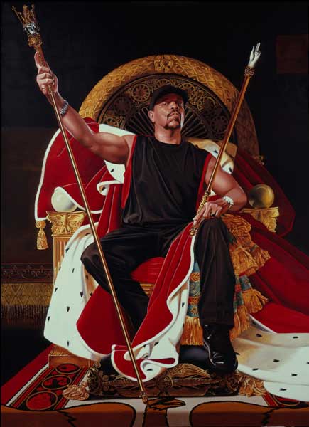
1. Kehinde Wiley (painter)
2. Cedric Rivrain (illustrator)
2. Cedric Rivrain (illustrator)
3. Dane Shitagi (photographer)
4. Charlie Engman (photographer)
5. Wes Anderson (writer/director)
6. Banksy
11.08.2010
11.04.2010
11.02.2010
final infographic posters!
though i'm loving this couple day break, i'm going to miss working on these posters!
i may be alone in saying this, but i really enjoyed working on these, especially toward the end.
not to mention, the process book was a lot more fun for me this time since i didn't wait until the last minute. :)
[even though copy co. had to go and bind it incorrectly THREE times, typical. definitely going to experiment with new ways to bind for the last project..]
anyways, i'm looking forward to the packaging project, as i think it will be really interesting and one of my favorite projects from my high school design class was creating CD packaging.
anyways, here are my final posters, and enjoy this temporary slowing-down of homework!
typographic-based
[i don't know why this didn't crop off the bars at the bottom, so just ignore it..]
image-based
11.01.2010
typography in motion
firstly, what a hectic week it was. woof.
however hectic, starting motion typography was pretty exciting. i enjoy learning how to do new things and use new programs, so learning after effects was both interesting and a new kind of challenge. i still don't think i'm quite optimizing the entire potential of the program, but considering we had only a crash course, i don't think it's too bad!
i just uploaded my animatics and initial piece (before refinements) to vimeo, and a refined and final version will be up at the end of the week! a little worried for the final due on wednesday, but i think with some refinements, it won't end up half bad. check 'em out, and be kind. i'm not fully grasping concepts, transitions, and ways the type can interact, quite yet.
THIS IS STILL A HOT MESS, YOU HAVE BEEN WARNED.
weather in motion animatics from emily austin on Vimeo.
weather in motion from emily austin on Vimeo.
ps! just uploaded the icons project and our infographics project onto my behance. if ya like it, like it.
Subscribe to:
Posts (Atom)


