Here are some successful (and not so successful) logos I have found while doing some research for the Summerfest logo. More specifically, these are re-designs of pre-existing logos, something especially relevant to our current project!
The NFL logo is widely used, and widely reproduced, especially on clothing. Because of this factor, the company wanted a logo that was more legible and more easily mass-produced. I think losing the curly serif on the 'L' and adding intensity to the blue, as well as simplifying the number of stars all work together well to create a legible and easily recognized logo.
A lovely example of simple is better. Though the first logo conveyed the scientific material of the channel well by using an orbiting Earth, the second works even better as it is fast to recognize and fast to read. Choosing to design the logo after an element on the Periodic table is extremely successful, and an almost obvious idea. The end result is a clean, recognizable logo.
Now for the less successful...
A big "woops" in my opinion. Gap has since changed their logo back, due to public outcry from designers and consumers alike. Not only does the revision look thrown together and plain, but it doesn't say Gap as well as the previous logo had. In some cases, it seems that such an iconic logo should not be innovated.
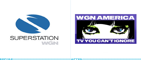
This re-design is simply confusing to me. I understand that the company is a TV station, and that a new logo could better convey this, but the photoshopped, cropped MySpace picture they included in the revision just isn't working.
What do you think?
You can view more logo re-designs HERE and HERE.


No comments:
Post a Comment